
If you’re an author on a budget or a self-publisher who loves to have complete control over your work, learning how to format your book yourself is a valuable skill. DIY standard book format saves money and gives you creative control over your book’s appearance. In this guide, we’ll explore the essential tools and techniques to help you format your book like a pro while saving both time and money.
Why Book Formatting Matters?
Book formatting isn’t just about making your book look pretty; it’s about ensuring readability and professionalism. A well-formatted book enhances the reading experience, builds your credibility as an author, and meets the requirements of platforms like Amazon Kindle Direct Publishing (KDP) and IngramSpark. Poor formatting, on the other hand, can lead to reader frustration and bad reviews.
DIY Book Formatting Tools
The right tools can make book formatting much easier and faster. Here are some of the best options:
1. Microsoft Word
- Why It’s Great: Many authors are already familiar with Word, making it a convenient and cost-effective choice.
- Features for Book Formatting:
- Styles for consistent headings, paragraphs, and text.
- Page layout tools to adjust margins and page sizes.
- Table of contents and page numbering.
- Best For: Simple layouts for both print and eBooks.
2. Scrivener
- Why It’s Great: Scrivener is a powerful writing and formatting tool designed specifically for authors.
- Features for Book Formatting:
- Compile feature to export your manuscript in various formats (ePub, PDF, MOBI, etc.).
- Easy management of chapters and sections.
- Best For: Authors who want an all-in-one tool for writing and formatting.
3. Atticus
- Why It’s Great: Atticus is an all-in-one book formatting software that’s user-friendly and cloud-based.
- Features for Book Formatting:
- Drag-and-drop design elements.
- Pre-designed templates for professional-looking books.
- Exports for print and eBook formats.
- Best For: Authors who want an intuitive, professional tool at a reasonable cost.
4. Reedsy Book Editor
- Why It’s Great: Reedsy’s free online tool simplifies the formatting process.
- Features for Book Formatting:
- Automatic styling and formatting.
- Exports in PDF and ePub formats.
- Best For: Budget-conscious authors who need basic formatting.
5. Vellum (Mac Only)
- Why It’s Great: Vellum is renowned for creating beautiful, professional books.
- Features for Book Formatting:
-
- Easy-to-use interface.
- Templates for print and eBooks.
- Real-time preview of your book.
- Best For: Mac users looking for top-notch results with minimal effort.
DIY Techniques for Book Formatting
Formatting a book can be tricky, but with the right approach and tools, you can get great results on your own. Here’s a simple breakdown to help you navigate each step:
1. Set Up Your Document Correctly
Before diving into formatting, it’s crucial to get your document ready with the correct settings:
Page Size
Before you begin formatting, it’s important to set the correct page size for your book. If you’re preparing a print book, the most common sizes are 6″x9″ or 5.5″x8.5″. These sizes are easy to work with and are widely accepted in the publishing industry. You can adjust the page size settings in your word processor under the “Page Layout” or “Page Setup” section. Be sure to choose a size that fits your vision for the book, as this will affect how the final printed version looks.
Margins
Margins are essential for creating a professional appearance and ensuring that the text doesn’t get lost near the edge of the page or during the binding process. For print books, it’s best to use wider margins, typically between 0.5″ and 1″ on all sides. This allows space for the book’s binding and ensures that no text is cut off. Additionally, if your book is thick, you should add a gutter margin, which gives extra space on the inner side of the page to accommodate the binding, especially for books with a high page count.
Font and Font Size
The choice of font can have a significant impact on the readability and professionalism of your book. For a clean and classic look, fonts like Garamond, Times New Roman, or Arial are great options, as they are easy to read and widely used in print and digital publications. When selecting a font size, it’s standard to stick with 11pt or 12pt for body text. This size ensures that your text is clear and legible, providing an enjoyable reading experience without straining the eyes.
2. Use Styles for Consistency
Styles are super important for keeping everything consistent throughout your book:
Headings
Consistency in your book’s headings is key to making it look organized and professional. By using specific styles, like “Heading 1” for chapter titles, you ensure that all headings are uniform across the entire manuscript. This helps readers easily recognize the start of each chapter or section. It also makes it easier to generate a table of contents, as most word processing software will automatically pull these headings to create the list. Consistency in heading styles is an important part of formatting your book to look polished.
Body Text
The body of your book should also have consistent formatting to make it flow smoothly. Applying a “Normal” style to your body text will ensure that all paragraphs follow the same formatting rules, like font choice, size, and spacing. This makes your book look cohesive and easy to read. You don’t need to manually adjust each paragraph since using styles will save time and effort while ensuring that the body text remains uniform.
Custom Styles
Creating custom styles is very useful for elements like quotes, subheadings, or special sections within your book. Custom styles allow you to give these sections unique formatting while maintaining overall book consistency. For example, you could create a style for quotes that indents the text or changes the font slightly. Having a separate style for subheadings allows you to distinguish them from the main body text, making your book more visually appealing and easier to navigate.
3. Format Paragraphs and Line Spacing
For a clean and professional look:
Paragraph Alignment
When it comes to paragraph alignment, a justified alignment is generally the best choice for books. This means the text will stretch across the page, aligning neatly with both the left and right margins. It creates a clean, professional look and ensures the text fills the page without uneven spaces between words. Justified text can make the reading experience feel smoother, especially in printed books.
Line Spacing
To ensure your book is readable, it’s important to adjust the line spacing. A setting of 1.15 or 1.5 line spacing is ideal for readability. These options create enough space between lines to prevent the text from feeling too cramped while still keeping the paragraphs close enough together for a consistent flow. It’s also important to avoid double spaces after periods. This was common in the past, but modern formatting standards use just one space after a period, which helps the text look more polished.
4. Add Page Numbers and Headers/Footers
Having page numbers and headers or footers keeps your book organized:
Page Numbers
Page numbers are essential for guiding your readers through the book. They should be placed in the footer, as this creates a clean and organized layout that doesn’t distract from the main content. You can set up section breaks in your document to ensure different sections of the book, such as the front matter and the body text, have separate headers or footers. For the first few pages, like the title page and copyright page, you can choose not to number them. This helps maintain a more professional look in the front of your book.
Headers/Footers
Including headers and footers in your book can provide useful information without interrupting the content. For example, the header could include the book title or the chapter name, which helps readers easily navigate through your book. The footer is typically used for page numbers, but it’s also a good place to add small details, such as the author’s name or the book title, to reinforce the book’s identity. Using section breaks allows you to have different headers and footers for various parts of your book, keeping the formatting flexible.
5. Design Chapter Pages
Each chapter should feel distinct:
New Page for Each Chapter
Each chapter of your book should begin on a new page to provide a clean visual break between sections. This not only makes the book more organized but also signals to the reader that a new section has begun. By doing this, you give each chapter the space it needs to feel distinct from the previous one. This also makes your book more readable and aesthetically pleasing.
Chapter Titles
Chapter titles should stand out from the body text to make them easily identifiable. Center-aligning the chapter title and using a larger font size will draw attention to it. This helps establish a clear structure and hierarchy for the book. Larger fonts for chapter titles give the pages a balanced look, and it visually cues the reader that they are entering a new section of the book.
Drop Caps
Adding drop caps, which are large initial letters at the start of a chapter, can give your book a more professional and polished appearance. It’s a small but effective design element that can make a significant difference in the presentation of your chapters. Drop caps are traditionally used in print books to mark the beginning of a new chapter, making the text more engaging and visually striking.
6. Include Front Matter and Back Matter
The front and back matter provide important information for your readers:
Front Matter:
The front matter of your book is the first part that readers will see, so it’s important to make it structured and informative. This section typically includes the title page, which features the book’s name and author, and the copyright page, which includes legal information about the book’s ownership. You may also want to include a dedication, acknowledgments, and, if it’s a non-fiction book, a table of contents. These elements give readers essential information before diving into your book’s main content.
Back Matter:
Just as important as the front matter is the back matter, which contains information after the main content of your book. This section may include an “About the Author” page, which gives readers insight into your background and details about other works you’ve written. It’s also common to include a call-to-action, such as a suggestion to follow you on social media or check out your website. The back matter is a great way to connect with your readers and encourage them to engage more with your work.
7. Optimize for Print and eBook
Remember that print books and eBooks require different formatting methods:
Print Formatting:
When preparing your book for print, there are a few key elements to focus on. First, make sure your margins and headers/footers are properly set. Images should also be high-resolution to ensure they look clear and sharp when printed. Once everything is properly formatted, you can export your document as a PDF, which is the standard file format for printing. A PDF ensures that your formatting remains intact, whether you’re printing a few copies or working with a larger print run.
eBook Formatting:
eBook formatting is a bit different from print formatting because eBooks need to be compatible with different devices and screen sizes. When formatting for an eBook, use reflowable text so that the content can adjust and reformat itself depending on the device it’s being viewed on. Avoid overly complex layouts, as these may not display correctly on eReaders. Stick to basic, readable fonts and keep the design simple. When your eBook is ready, export it as an ePub or MOBI file, which are the most widely accepted formats for eBooks.
Let’s Wrap Up
Formatting your book doesn’t have to be intimidating or expensive. By using the right tools and techniques, you can create a professional-looking book that enhances your readers’ experience. Whether you’re preparing a manuscript for print or an eBook, this DIY approach empowers you to stay in control while saving both time and money.
Ready to take the leap? Choose your tools, follow these steps, and watch your manuscript transform into a polished, professional book.
1. Why is book formatting important?
Proper book formatting is crucial because it ensures your book is visually appealing and easy to read. Good formatting enhances the reader’s experience, making the text flow smoothly and look professional. It also ensures that the book meets industry standards, which are essential for print and digital versions. Proper formatting can significantly affect how readers and reviewers perceive your book.
2. What are the key elements of professional book formatting?
Professional book formatting includes several key elements, such as consistent font usage, appropriate margins and line spacing, correct indentation, and proper alignment of text. It also involves adding elements like a table of contents, headers, footers, page numbers, and properly formatted chapter titles. Additionally, attention to detail in aspects like paragraph spacing, justification, and the placement of images or illustrations is essential to create a polished final product.
3. Should I use special software for formatting my book?
While you can use basic word processing software like Microsoft Word for simple formatting, specialized book formatting software like Adobe InDesign or Vellum can offer more advanced features and greater control over the layout. These programs are designed for publishing and can help ensure your book meets industry standards. They provide tools for precise layout adjustments, professional typesetting, and compatibility with various eBook formats.
4. Can I format my book for print and eBook versions myself?
Yes, you can format your book for both print and eBook versions yourself, but understanding the differences between the two formats is required. Print books need attention to fixed layouts, margins, and page numbering, while eBooks require reflowable text that adjusts to different screen sizes and devices. Many authors choose to format their books using software that can handle both formats, or they may hire a professional to ensure that the formatting is correct for each version.
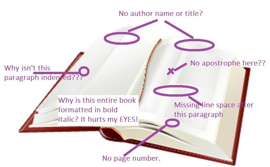
5. What common formatting mistakes should I avoid?
Common formatting mistakes to avoid include inconsistent font usage, improper margins, and incorrect line spacing. Other errors include missing or incorrectly placed page numbers, poorly formatted chapter titles, and neglecting to include a table of contents. It’s also important to avoid overusing bold and italicized text and improper indentation and alignment. Attention to these details can help ensure your book looks professional and is easy to read.